Welcome! You’ve found your way into my portfolio site. I’m going to take this opportunity to take you on a journey to better understand what I do and who I am. Let’s begin! Over the course of my career, I’ve narrowed down the scope of what I do into two words: Communication and Design. Two simple words that encompass two fields of work. Communication relates to marketing materials, outreach and content for a target audience and design encompasses a wide array of creative skills that, for me, highlight animation, graphic design, branding, presentation design and storyboarding.
Two simple words that together, pack a big visual impact and memorable story for audiences around the world.
Let’s get in the weeds a little. Here’s my creative process broken down into three sections:
1. Storyboarding
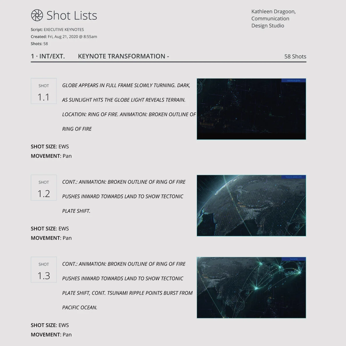
Communication Design begins with putting pen to paper and having a conversation. I work with executive teams and individuals to build scripts and storyboards. Using tools like Studio Binder and skeleton decks in Keynote help map out how the story can be told in a way that speaks to the audience.
2. Creating
An event with aggressive deadlines and global teams that has hundreds of people involved, requires management skills and creative tools to successfully meet deadlines and communicate ideas. I use online platforms such as StudioBinder, Frame.io, Slack and Asana to visually communicate and edit frames across teams. Adobe Creative Suite is what I use for creating visuals. The media files then come together to tell the final, finished story using Powerpoint, Keynote or as a video for a prerecorded, digital conference.
3. Outreach
Whether it’s live audience attended conferences, digital conferences, an internal presentation or general summit, a new business pitch deck, or instructional presentation to be used online and in classrooms, presentations are there to tell your story.
Let’s explore those sections and get into my portfolio
1. Storyboarding
This is usually a series of meetings between all teams to decide the look of the event. Here are a few pitches I’ve created for clients that illustrate how the graphics will appear across different platforms and what color pallet and design approach is taken and why.
You’ll notice that the graphics communicate something symbolic. They don’t spell out the message but are meant to reach the audience on a subconscious level. Thinking about how to design graphics to reach a target audience is key. You have to understand your audience, the client, and the speaker. All of this requires a deep understanding of people and behavior.
2. Creating + 3. Outreach
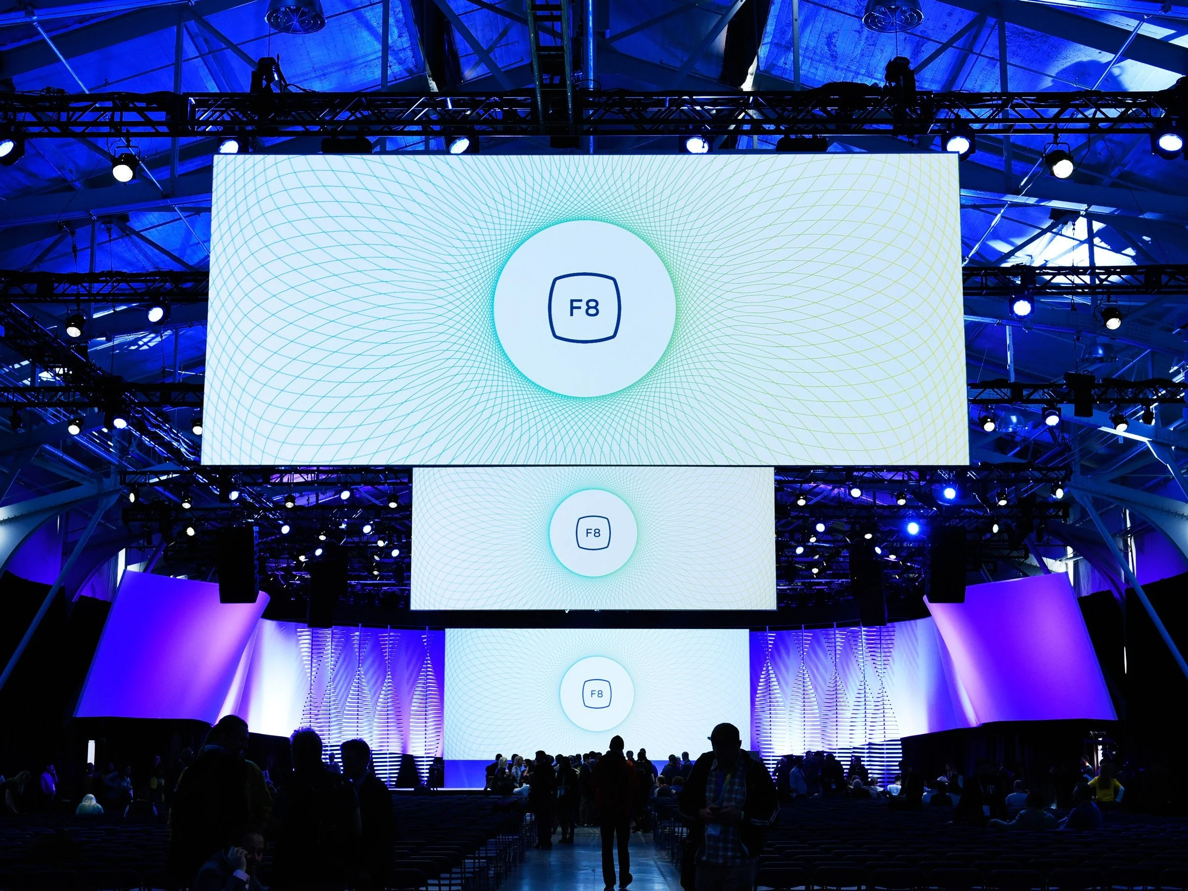
As you continue to scroll, you’ll find examples of conferences and projects I’ve worked on to better give an understanding of the range, complexity and collaboration it takes to create presentations that reach a global audience. I’ve sectioned it out so that it’s a little easier to digest. This is a combination of the 2. Creating step, you’ll see the presentations in their original form, and, more interestingly, step 3. Outreach, how the graphics appeared in the real word, on stage and with presenters. Enjoy!


